|
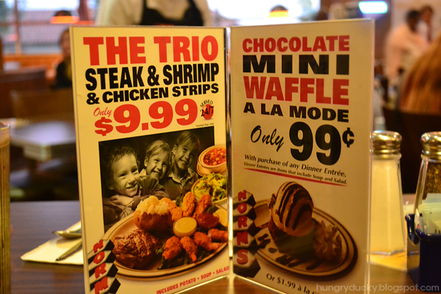
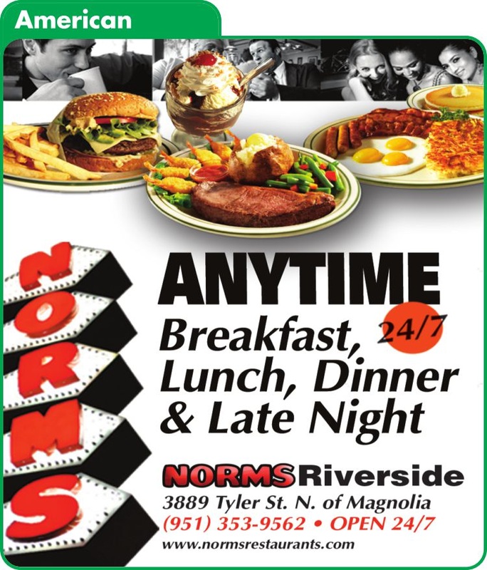
Hey guys, check out this new Web Series that I edited and created the Title Sequences for. It stars Jenifer Lewis, you know Tina Turner's mama, Jackie's Back ... Juwanna Man. The show also stars, Shangela Debutantess from RuPaul's Drag Race season 2,3,4,5,6, and 7 lol. The first episode launches Sept. 5th! So, make sure to Subscribe, like and leave a comment now! An quick analysis of layout and design from local and nation diner menus. From Ihop to Spires there is no diner menu that is more beloved by me than one with pictures of the food on it! Yes, like Stewie, I do enjoy menus with pictures of the food on it! Who has time to read these days... when you can just point and grunt at what you want. I truly love Norms Diner (A local Southern California Diner), not only because they have ridiculously outrageous specials but because of all the colorful and interesting people who go there, especially late night. Everything from cross dressing trannies to the elderly like to pop into this diner to enjoy a decent meal. (Especially the Norms on La Cienega)
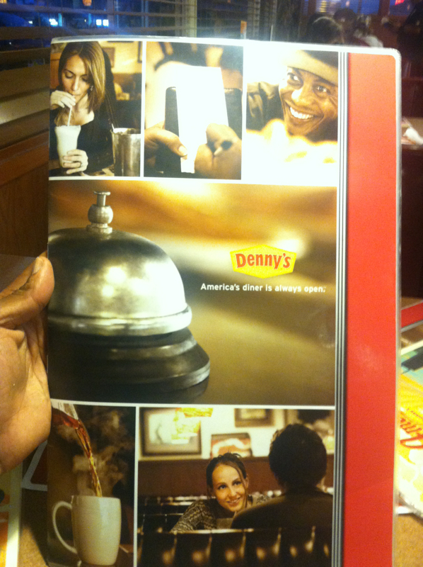
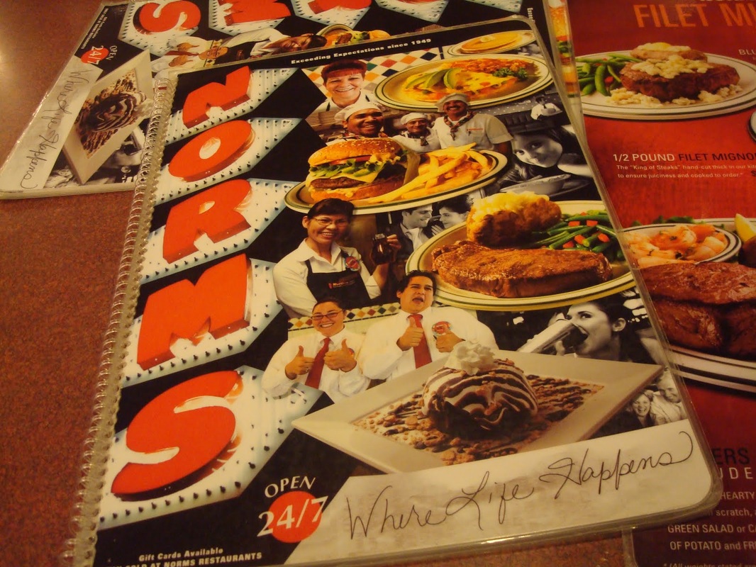
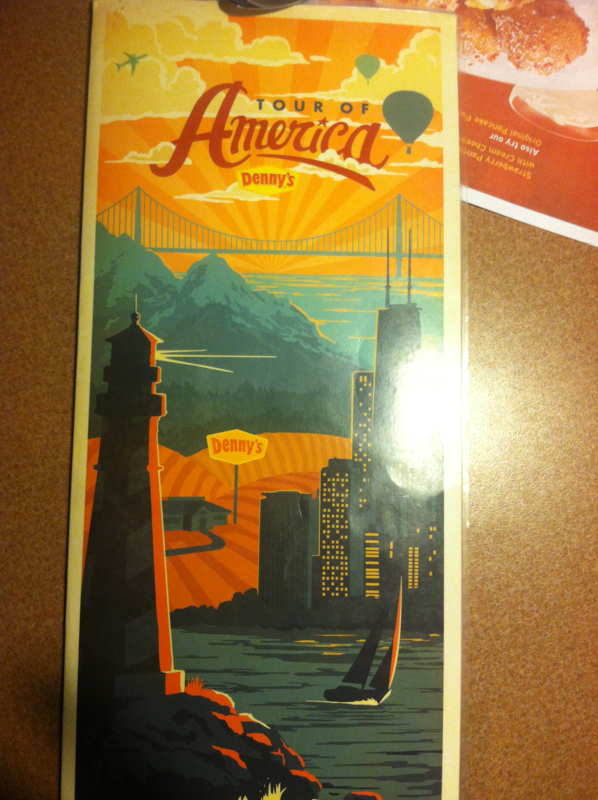
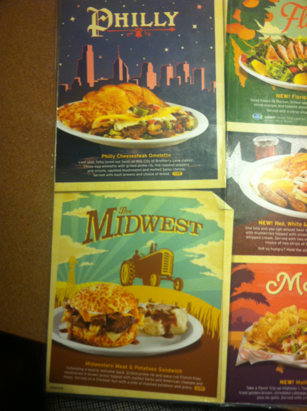
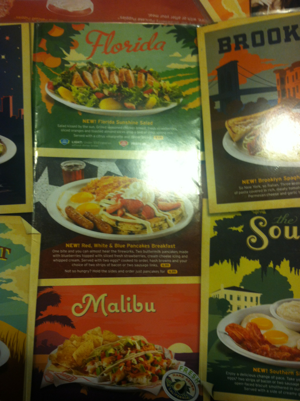
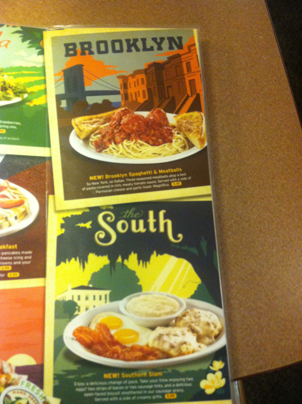
While dining at Norms back in 2010, it was very refreshing to see throughout all of the marketing materials, especially the menu, photos representing the unique patrons that frequent the diner. By the way, the SAME Marketing is still being used in 2012, crazy right? The realistic snapshots gave Norms a sense of authenticity and established a colloquially dialogue with it's guest. Norms knows that it's not only the patrons who visit the restaurant, that make it what it is, but the employee's as well, I mean look at the cover above there are so many people who actually work there on it. To my surprise, when I visited a local Denny's last week, I found that they had recently adopted the same tone and feel to their menus. Denny’s is clearly putting their patrons first and foremost instead of the food. There isn’t even any food on the cover. Just drinks and customers, who are happily engaged in something (each other’s company or sipping a shake) whatever they are doing, they are enjoying it with a smile that seems genuine and not forced.) I think that this approach is a good strategy for Denny’s (although clearly stolen from Norms) because when I sat down at the booth, I was immediately drawn in and felt like, “Yeah, that’s me right there!” The menu conveys a sense of coolness and a tone that is very warm (literally look at the steam coming off of that hot coffee) and inviting with rich warm browns and swirls of tan / yellow colors. The Denny’s cover also says to me that, “Hey…you can just come in for a quick sip…nothing too serious, maybe a quick conversation with a friend over coffee… we wont even pressure you into eating an entire meal.” Overall I think Denny's pulled off the execution better. The menu pops with color, displays a splendid array of photographs, illustrations and typography that is a visual feast for the eyes. Norms however needs to switch it up a bit. Back in 2010 the black and white photos with juxtaposed orange type made it feel like I was embarking on a mini documentary in a menu, but now it feels kind of dated. In conclusion, LONG LIVE THE DINER MENU WITH PICTURES OF THE PATRONS (and some food) ON IT! |
Archives
January 2023
|



 RSS Feed
